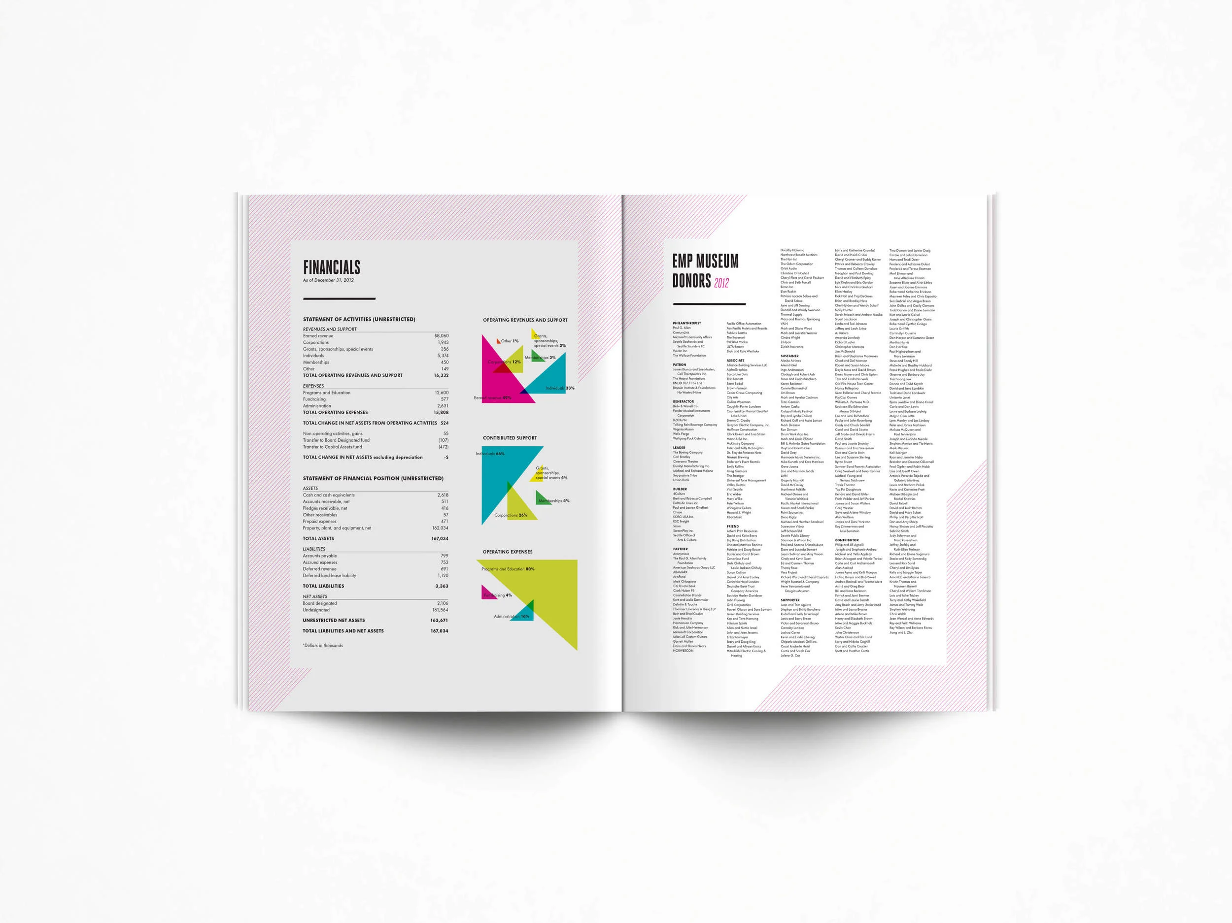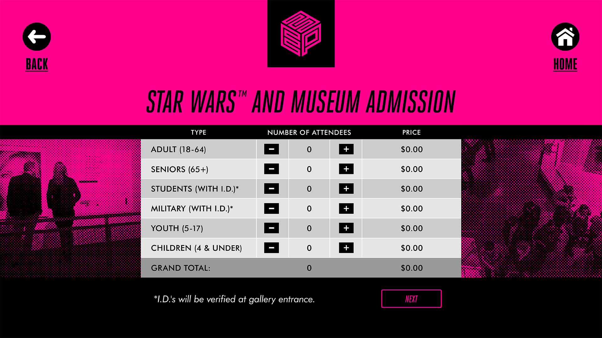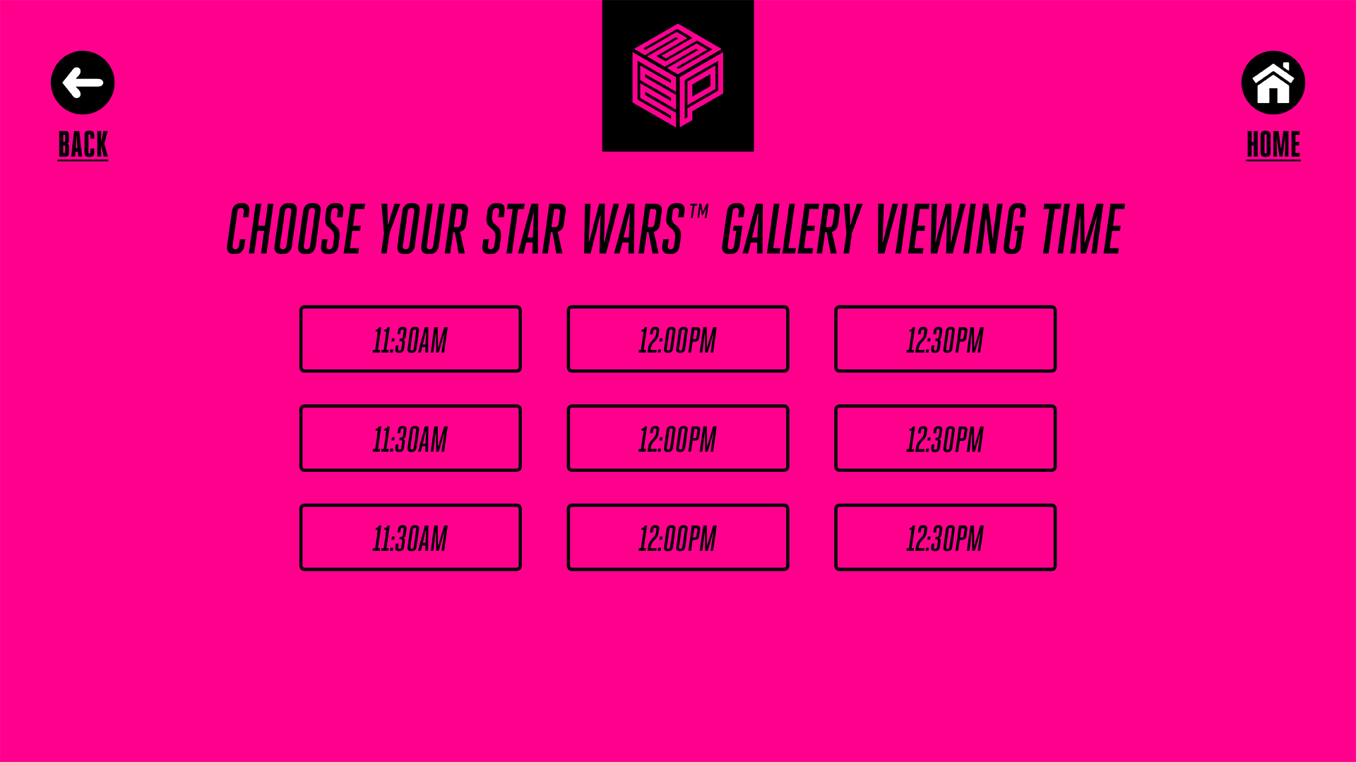
When I first started at EMP Museum, the institution was in the preliminary stages of a rebrand. The logo had just been designed by Publicis, and the brand colors and typefaces were selected. I had the rare opportunity to take these elements and establish a new visual brand identity for the institution. I was also tasked with implementing this new creative direction on all print, digital, and environmental museum collateral. This included — but was not limited to — business stationary, web and social media, annual reports, gallery maps, admission stickers, museum way-finding, environmental graphics, brochures, digital signage, and promotional campaigns for both public programming and exhibits. This rebranding effort called for a complete examination of existing collateral, with the freedom to re-envision and design these pieces from the ground-up. In short, it was a complete visual overhaul. Project Goals: I wanted the brand to be bold and energetic, fun and playful, yet still sophisticated. Execution: Since the logo is highly geometric, I wanted to carry that geometry and graphic approach throughout the brand identity, utilizing bold lines, triangles, and repeating patterns. I embraced the vibrant color palette, making it an integral and driving force in each creative piece, often utilizing bitmaps for added texture and visual interest. Typography is clean and modern, though bold and arresting.
Logo: Publicis Art Direction: Melissa Robinson Designers: Melissa Robinson, Jeffrey Underwood, Chelsea Wirtz